The Wharton School has a long history being—if not disputably the best—one of the top business schools in the world. World-renowned and well-respected, the school benefits generous fundings and gifts from various sources. Often these contributions can be seen as concrete dedicated structures and buildings around Wharton’s campus. Students, faculty, staff, and visitors can all enjoy and take pride in Wharton’s dedicated communal spaces.
As part of cutting and maintaining operations costs, one of the school’s decision was to create its own café instead of continuing contracts with national café service brands. The school wanted more than just a café, but also one with the Wharton brand. The brand had to be perceived as though it had always been a part of the Wharton School. Joseph Wharton was the perfect brand figurehead: the fortuitous shortened name of this founder all fit into the inception of Joe’s Café.
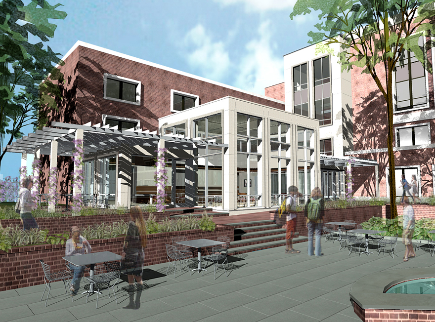
The branding exercise was twofold: 1) creating a new brand identity, and 2) complement its branding within a newly built and dedicated space.
Design exploration began quickly, scheduled to coincide with the opening of the new space. Woodcut was a logical art direction: the look evoked academia, literature, and hand-crafted; the look also referenced to a specific time in history that complemented Wharton’s established year.
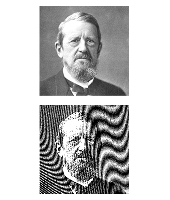

Once art direction was established, production quickly followed: creating and putting the graphics together. Since time and budget were both limited, the woodcut process was simulated digitally. With proper application filters and know-how, graphic resources were converted to digital and details were refined. The final touch was selecting an appropriate typeface; the natural choice was a heavy slab cut face to evoke the collegiate legacy. The logo was practically done.
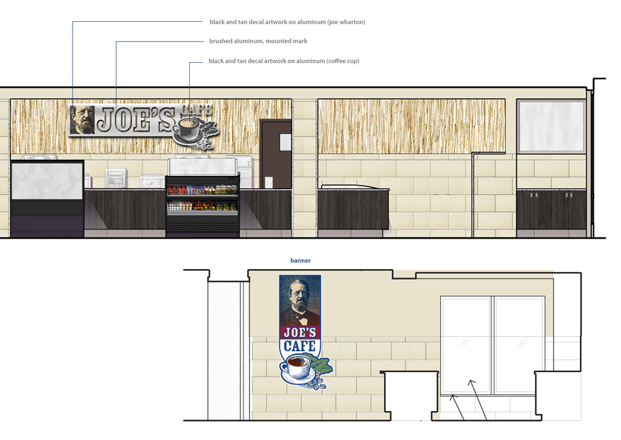
The main signage was decided to be constructed with a brushed metal finish to offset the overall light brown wall. The finish also complemented the stainless steel equipment, allowing the logo to have a strong presence. Budget also dictated how the complex the signage would be: simple lines to reduce metal-cutting cost, and simple surface contrasts were set to play off each other, producing maximum visual attraction. Large decals of the full-color version of the logo were placed on glass windows and doors leading into the building. The decals faced outward to campus and an immediate patio seating, gaining maximum attraction from foot traffic.
Joe’s Café was a budgeted quick-solution that utilised internal design resources and minimised production costs. It was an exercise in timeliness and precise execution. It was a small, but ultimately visually impactful, part of a complex project roll-out. It was coordinated with other non-design schedules to converge at a critical point where everything came together as a whole.